Color Matching Brand Logos in DTF: Pantone Reality

A customer sends a logo with a Pantone number and expects the finished DTF transfer to match the color chip exactly. That sounds straightforward, but screens, print profiles, transfer film, white ink, heat, fabric, and lighting all affect what the final color looks like.
Accurate brand color reproduction is possible, but the practical goal should be a controlled, approved match—not an unconditional promise that every Pantone color will look identical on every garment.
Why a Pantone Number Does Not Guarantee an Exact DTF Match
Pantone colors are standardized references commonly used to communicate brand colors. A Pantone chip gives a designer, printer, and customer a shared visual target, but it does not automatically define the exact ink mixture produced by a DTF printer.
Traditional Pantone spot-color printing can use a specially mixed ink for one color. DTF printing generally creates colors by combining channels through a digital print process. The printer, ink set, RIP software, ICC profile, and artwork values work together to approximate the requested color.
That distinction matters because some Pantone colors fall outside the range that a particular digital printing system can reproduce. Highly saturated oranges, deep blues, bright greens, fluorescents, and certain purples can be especially challenging. For more detail on unusually bright colors, see our guide to neon and fluorescent colors in DTF.
The Pantone reference itself can also create confusion. Coated and uncoated Pantone libraries represent colors on different paper surfaces, while a DTF transfer is applied to fabric. A glossy phone screen, a matte color guide, and a cotton shirt do not reflect light in the same way.
Think of Pantone as the target
A Pantone number is valuable information, and you should include it when color is important. However, it is best treated as a target for proofing rather than a guarantee based on the number alone. Final approval should come from a physical transfer pressed onto the intended garment.
What Changes Logo Color From File to Finished Shirt
Color matching problems often begin before the artwork reaches the printer. A logo may have been copied from a website, saved from a screenshot, converted between color spaces, or exported with a different profile. Two files that look similar on screen can contain very different color values.
| Variable | How it affects color | Best practice |
|---|---|---|
| Artwork values | RGB, CMYK, and spot-color conversions can shift the logo. | Use the original brand file and document the target Pantone number. |
| Monitor | Brightness and display settings can make colors appear more vivid. | Do not approve critical color from an uncalibrated phone or monitor alone. |
| Printer profile | The RIP translates file values for a specific printer and ink set. | Avoid repeatedly converting or adjusting files without a physical test. |
| White underbase | White ink supports opacity but can influence the perceived depth of color. | Evaluate the complete transfer rather than judging color channels separately. |
| Heat pressing | Time, temperature, pressure, and reheating can alter the final appearance. | Use consistent press settings and test with the production garment. |
| Fabric | Garment color, weave, texture, and dye can change visual perception. | Approve the logo on the exact blank style and color whenever possible. |
| Lighting | A color may look different under daylight, retail LEDs, or warm indoor bulbs. | Review samples under more than one common lighting condition. |
Garment texture is easy to overlook. A smooth performance shirt presents a transfer differently than a coarse heavyweight cotton tee. Stretch, pressure, and surface irregularities can also affect the finished print. Consistent preparation helps, which is why shops should understand why pre-pressing every garment matters.
Even the surrounding shirt color influences the eye. The same red logo can appear brighter on black and softer on cream, despite identical printed values. This is a perception effect, but it still matters to the customer approving the product.
How to Prepare Brand Artwork for Better DTF Color Matching
Start with the cleanest source file available. Vector files such as AI, EPS, PDF, or SVG are often useful because they preserve sharp edges and defined color values. A high-resolution PNG can also work when it is exported correctly with transparency.
Build a usable color specification
For each critical brand color, collect the following:
- The Pantone reference, including the correct coated or uncoated designation when available.
- The official RGB and CMYK values from the brand guide.
- The original vector logo rather than a screenshot or downloaded thumbnail.
- A physical reference approved by the customer, if one exists.
- The garment style, fabric composition, and color intended for production.
Do not assign a Pantone number by sampling a customer’s website. Web images may be compressed, and browser or display settings can change their appearance. If the customer does not have formal brand standards, explain that the first approved physical sample will become the production reference.
Avoid unnecessary file conversions
Repeatedly moving artwork between RGB, CMYK, and different software profiles can cause color drift. Keep an untouched master file, then create a production copy for any adjustments. Name revisions clearly so an older, unapproved logo does not return in a later order.
For logos that depend on vivid gradients or expanded color detail, HyperColor 9-color RGB DTF transfers provide additional color channels for a broader visual range. They can improve reproduction of certain artwork, but no expanded-gamut process should be treated as a guarantee that every Pantone spot color is exactly reproducible.
Create a Repeatable Proofing and Approval Process
A physical proof is the most reliable way to settle color expectations before a large apparel run. It reveals the combined effect of printing, pressing, garment texture, garment color, and viewing conditions.
- Confirm the target. Ask which logo colors are brand-critical and whether the customer has a Pantone guide or approved physical item.
- Prepare controlled artwork. Use the original file, preserve transparency, and document any color-value changes.
- Print a small test. Include the production logo at actual size and, when needed, several labeled color variations.
- Press the intended blank. Use the same garment style, color, press settings, and finishing process planned for the order.
- Review under useful lighting. Check daylight and the lighting where the apparel will commonly be worn or sold.
- Record approval. Save the final file, transfer order details, blank SKU, press settings, and a clear approval note.
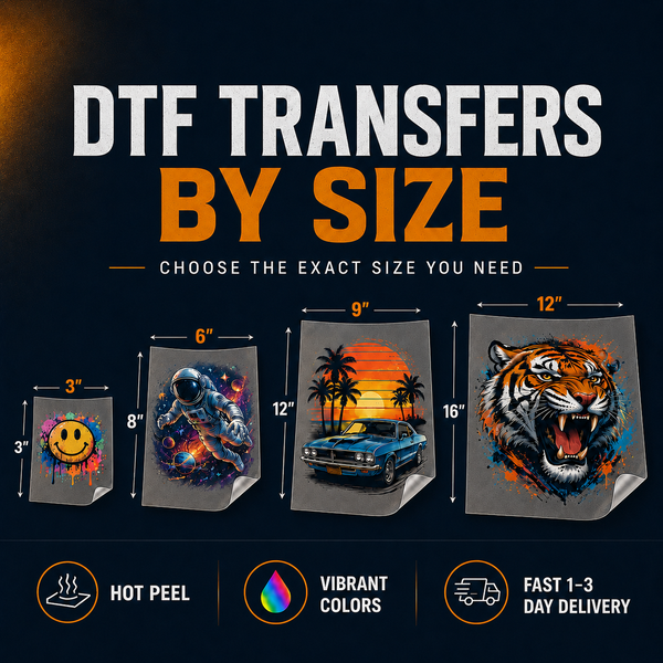
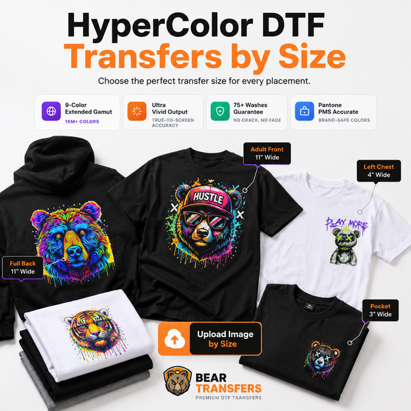
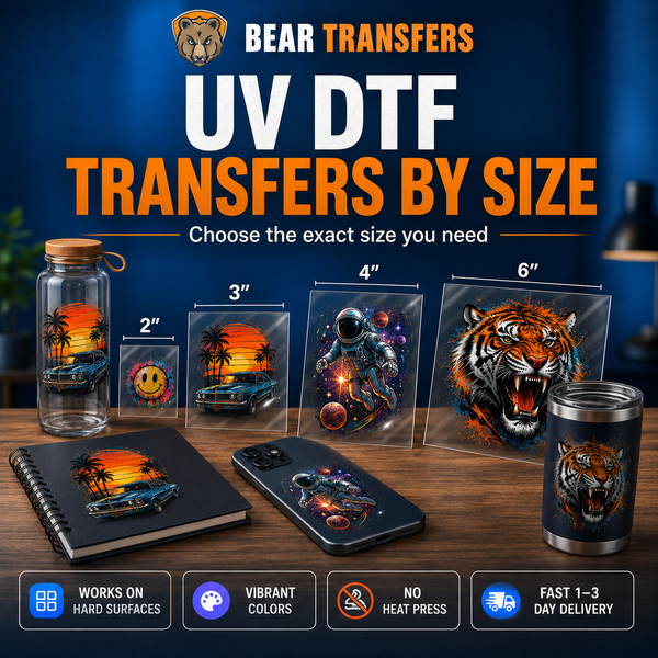
A DTF and UV DTF sample pack can help a shop understand transfer color, feel, and finish before setting customer expectations. For a specific logo proof, you can order DTF transfers by size without arranging a full production sheet.
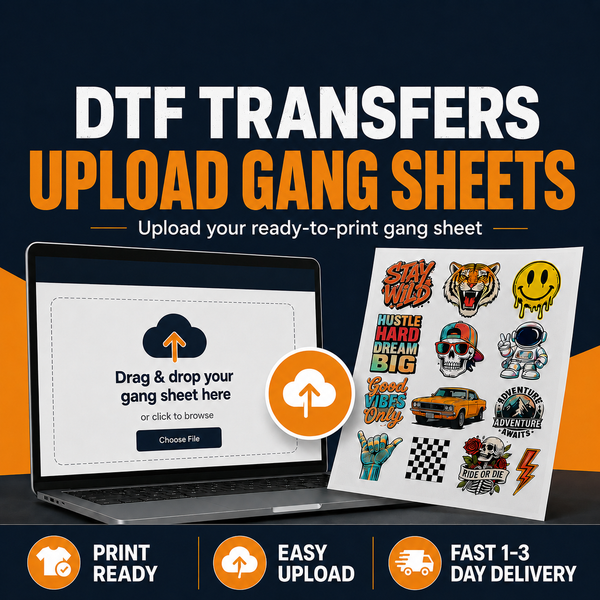
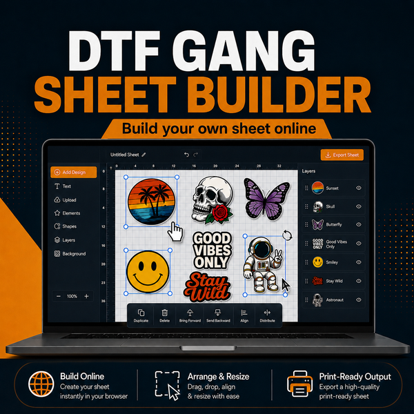
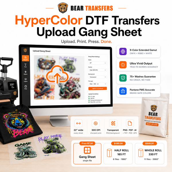
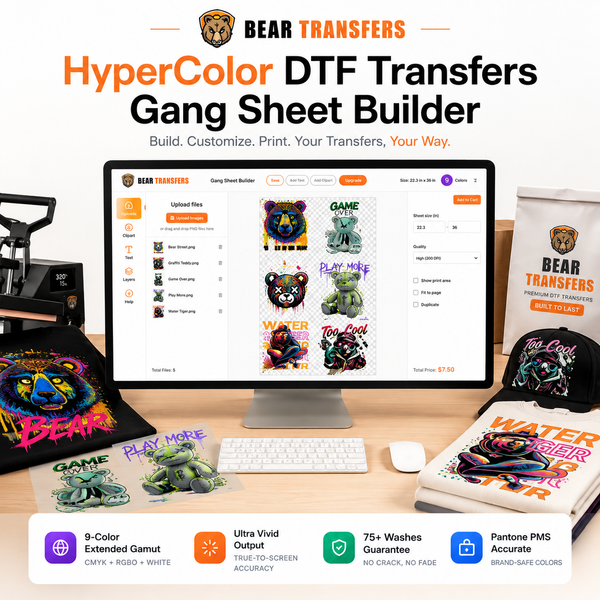
Once the logo is approved, keep the production workflow stable. Do not resize from a screenshot, rebuild the logo by eye, or make last-minute saturation changes because a monitor preview looks different. If your team has already arranged production artwork, you can upload a ready-made DTF gang sheet. Shops that prefer to arrange multiple logos in the browser can use the gang sheet builder instead.
Standardize the garment, too
Changing blanks after approval can change how the print is perceived. Record the manufacturer, style number, garment color, and fabric composition. Using consistent blank apparel priced near cost can make repeat orders easier to control while reducing unexpected differences between samples and production.
For demanding accounts, keep an approved shirt or transfer in a clean, dark storage location as a visual reference. Understand that physical samples can age or fade, so production records and original artwork should remain the primary documentation.
FAQ
Can DTF match an exact Pantone color?
DTF can produce close, commercially acceptable matches for many Pantone targets, but it is a digital printing process rather than a custom spot-ink system. Exact results depend on the color, printer gamut, artwork, profile, press process, garment, and lighting.
Should I submit RGB or CMYK artwork for DTF?
Submit the best original artwork available instead of converting files repeatedly. Include the official Pantone, RGB, and CMYK specifications when brand color is critical, and use a physical proof to approve the final result.
Why does the logo look different after pressing?
Heat, pressure, finishing, fabric texture, garment color, and ambient lighting can affect the final appearance. Press tests should use the actual production blank and consistent settings.
How should I handle a customer demanding a guaranteed match?
Define an approval process before production. Explain that the Pantone number is the target, provide a pressed sample, obtain written approval, and preserve the approved file and production settings for reorders.
When your artwork and color targets are ready, build a DTF gang sheet online for testing or production.